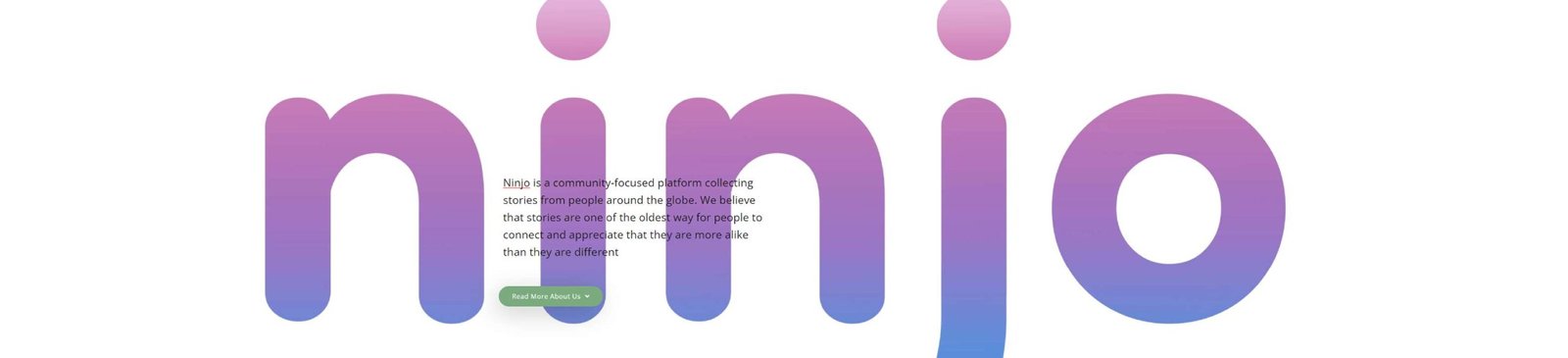
PROJECT
Ninjo.io
ROLE
UI/UX Designer
TEAM
Emily Edmonds, Project Manager
Carolina Creative Works
DATE
Feb 2022 – April 2022
Project Vision
Our client envisioned Ninjo being a community of diverse individuals sharing stories from around the globe. She believed that stories are the oldest way to connect, to share, and to heal. She picked the name Japanese word Ninjo because it means ‘human feeling’ or ‘human emotion,’ and by sharing our stories, we all could connect with the commonality of the human experience.
We were hired only as the UI/UX designers for this project. Their in house development team would be the ones implementing our suggestions.
Challenges
- Incredibly quick timeline and because it was a launch we didn’t have any historical user data
- Worldwide audience that will have a very diverse set of devices and knowledge interacting with technology.
- The client wanted to “do something different that captures the magic of web when it was new”.
- Information Architecture suggestions for the custom AI to aid users in discover new stories.
- The client had a very strong vision of design elements that they wanted to integrate.
Understanding the Problem
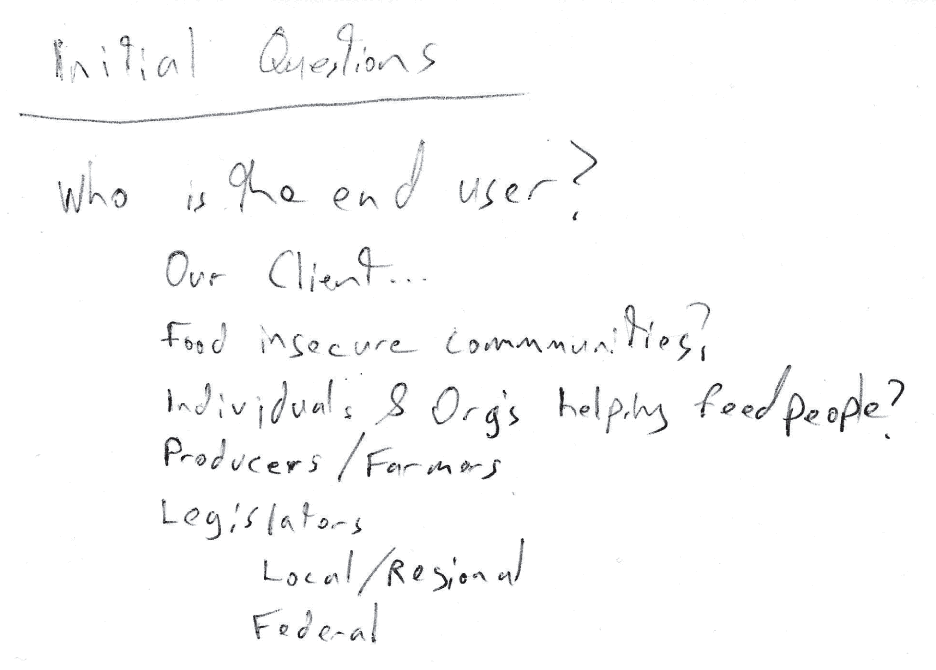
We knew user research was going to be the key to understanding and shaping how we were going to conduct the study.
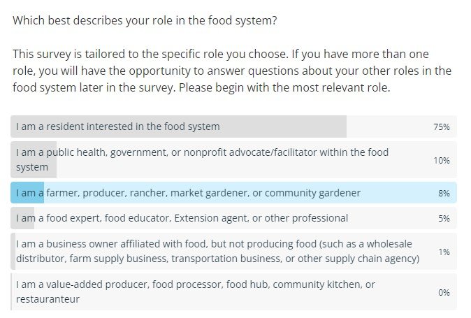
There was just one major issue: as soon as we were ready to start our community outreach component COVID-19 hit the world. Lockdowns went into effect before we could even conduct a single in-person meeting. While this challenge was overwhelming enough to cause us to consider postponing our study, in the end we knew we should continue. More than ever, people still needed food, farmers still needed to grow and distribute food, and both needed all the help they could to address systemic shortcomings in the food system.
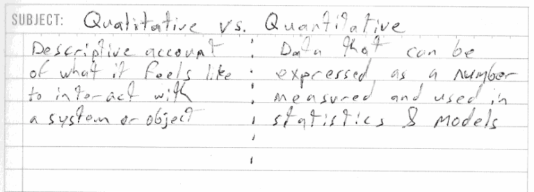
We transitioned to a hybrid method of outreach utilizing both in-person and online meetings. We created a comprehensive survey that allowed people to self-identify what role they played in the food system and give both quantitative and qualitative feedback on what worked and what didn’t in their local food system.
You can do anything but you can’t do everything…
Our client had a very extensive design brief and while it was lovely to have such a strong vision of what they wanted to try it did introduce challenges trying to balance getting the core functionality and not overwhelming the end user with information or non-standard ‘search & discovery’ UI elements.
Brand, Color, Action!
Our client also had hired a graphic designer to produce a brand kit and wanted that to be integrated into the design. The color palette was very vivid and was also a challenge to integrate into the design while making elements and text legible.
Lots of options without context tends to overwhelm. Our job was to distill down the list to what serves the user best, while still giving the client the magic they were looking for.
Information Architecture
The custom AI that the engineering team had built was up and running and had already established a list of emotions that was how they would categorize and tag stories.
Without reinventing the wheel, we needed to come up with very basic prototype UI elements that would use the pre-defined tags.
You don’t know what you don’t know
After iterating and a ton of competitive and related industry analysis, we determined that pushing the boundaries is only a good idea when people have some basis of comfort in ‘normal’ or industry standard search and discovery tools.
The client was very opposed to having feeds of any sort on the site. This presented an interesting challenge to work around.
Prototype
After a very short period, we started doing low fidelity prototyping. We’d then begin getting feedback from the internal “users” across the company, and then implement changes based on feedback. Again, we would have loved to do more user research, but the launch timeline didn’t allow for it.
Virtually no realty / How do you create magic?
With our client’s direction that they wanted users to feel “the magic of web when it was new”, one of our proudest ideas from this project was a blending of real world items, imagery and references to quickly help users gain an understanding and create a connection with Ninjo.
Out with the old, well not all of it
In the final prototype, we went with a mix of traditional and non-traditional UI elements. While we are content with the outcome of the prototype, there were a lot of suggestions(outlined below) that we wished we had more time to implement or gain insights from actual user research.
Our suggested changes to the project in the future:
- Refine the background color palette to be less vivid to improve readability and accessibly for users with colorblindness
- Refine font selection for body text, ideally with a serif font because this is an almost completely reading/text based site
- Further refinement of the mobile experience as a large portion of the intended audience will be accessing the site solely by mobile devices
- Conduct a usability study after launch to gain important perspective of the end users
Takeaways
We adore the Ninjo team, and we really love what they are trying to bring to the world. We’re happy with our contribution to the project, and it taught us a lot about setting expectations of what we can accomplish in a short timeline. It also helped us to learn to navigate when a client’s vision of design isn’t the same as ours, and how to blend and balance the team’s ideas with our own ideas.