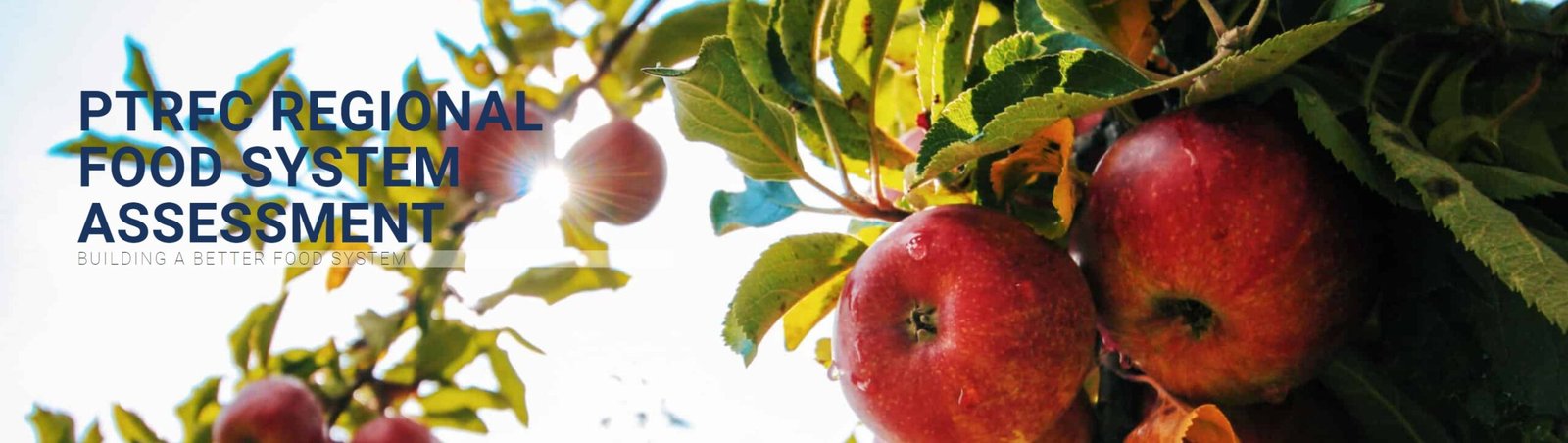
PROJECT
PTRFC Regional Food System Assessment
ROLE
UX Designer / Data Visualization Designer
TEAM
Emily Edmonds, Lead Researcher
Carolina Creative Works
DATE
Nov 2019 – Dec 2020
Project Vision
This was such an amazing project to be a part of. Nothing like this has ever been done in the southeastern US – a deep, community-based food system assessment of both production & food security to encompass the entire system.
Our aim was to conduct a data-driven study of the food chain as a whole, identifying where producers and consumers could benefit from regional and local changes that would make a stronger and more equitable food system in the Piedmont Triad region.
Challenges
- Incredible amount of information data to try & communicate
- Extremely varied end users that have differing levels of knowledge and interest
- Conflicting goals for the end data between the client’s needs and the desire to communicate information directly to citizens & community groups to create immediate improvement
- Finding tools that would allow for data visualization without an unreasonable amount of time investment or high costs a government couldn’t maintain
- COVID-19 lockdown made conducting meetings and gathering user research/data incredibly difficult
Understanding the Problem
We knew user research was going to be the key to understanding and shaping how we were going to conduct the study.
There was just one major issue: as soon as we were ready to start our community outreach component COVID-19 hit the world. Lockdowns went into effect before we could even conduct a single in-person meeting. While this challenge was overwhelming enough to cause us to consider postponing our study, in the end we knew we should continue. More than ever, people still needed food, farmers still needed to grow and distribute food, and both needed all the help they could to address systemic shortcomings in the food system.
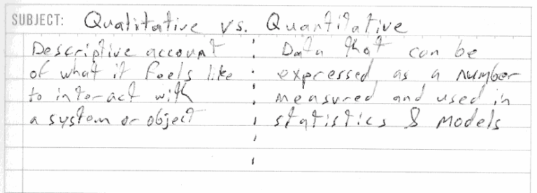
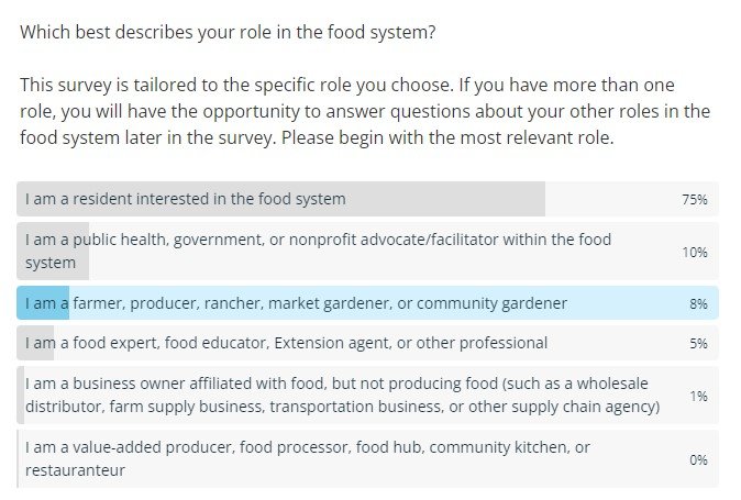
We transitioned to a hybrid method of outreach utilizing both in-person and online meetings. We created a comprehensive survey that allowed people to self-identify what role they played in the food system and give both quantitative and qualitative feedback on what worked and what didn’t in their local food system.
Hunger Writes White
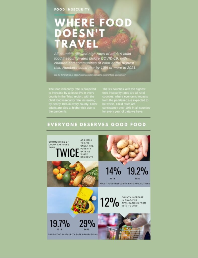
It became readily apparent that the most food insecure in a given community really only care about one thing: accessing food. If you’ve ever woken up or gone to sleep hungry, not knowing where you were going to get food next, you understand how all-consuming and terrifying that need becomes.
In short, members of the community who needed food didn’t care about the logistics of how food was made more available – just that it was. The overwhelmingly consistent message that food insecure participants expressed was: “We need options for affordable (or free), healthy food that can be accessed without spending hours to get to through public transportation or searching for a ride.”
“If you serve too many masters, you’ll soon suffer.” – Homer
Another issue that surfaced was the fact that the organization that commissioned the study was new and didn’t have representation from all the areas that it served. The organization’s mindset was focused on issues that were local; however, they were attempting to come up with solutions for an entire region. This also had the unintended consequence of them requesting us to focus on areas that were more ‘pro forma’ than critical.
In the end we decided as a team to create an online interactive overview of the most important findings & suggestions that anyone could access and actually use to start solving the issues.
Information Architecture
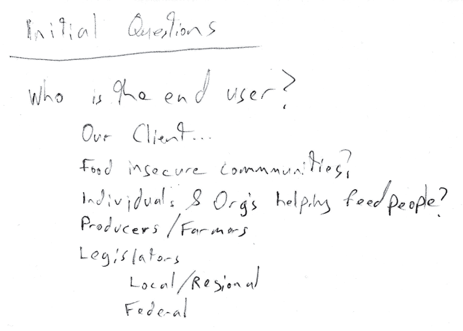
It became quickly apparent that in a complex system like the food system, even at a regional level, the amount of roles that we would both need to gather information from and present the results to was vast.
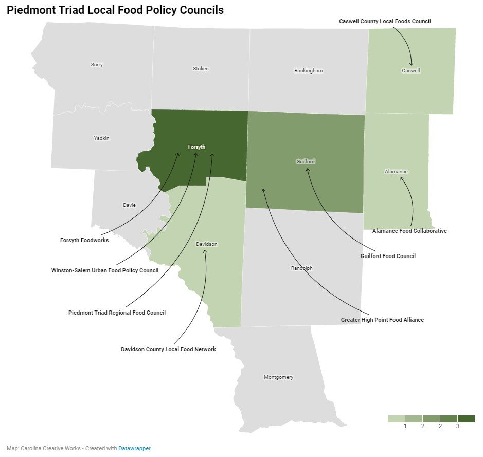
A large part of the IA was culling down the multitude of different stakeholders. Through careful 1 on 1 interviewing with “community champions”(i.e. people on the ground level of getting people access to food or helping farmers grow more), we were able to identify six role groups that were vital to food system operation.
Using these roles or end users as both the basis for how we would research and gather information for the study was a critical component of organization and IA.
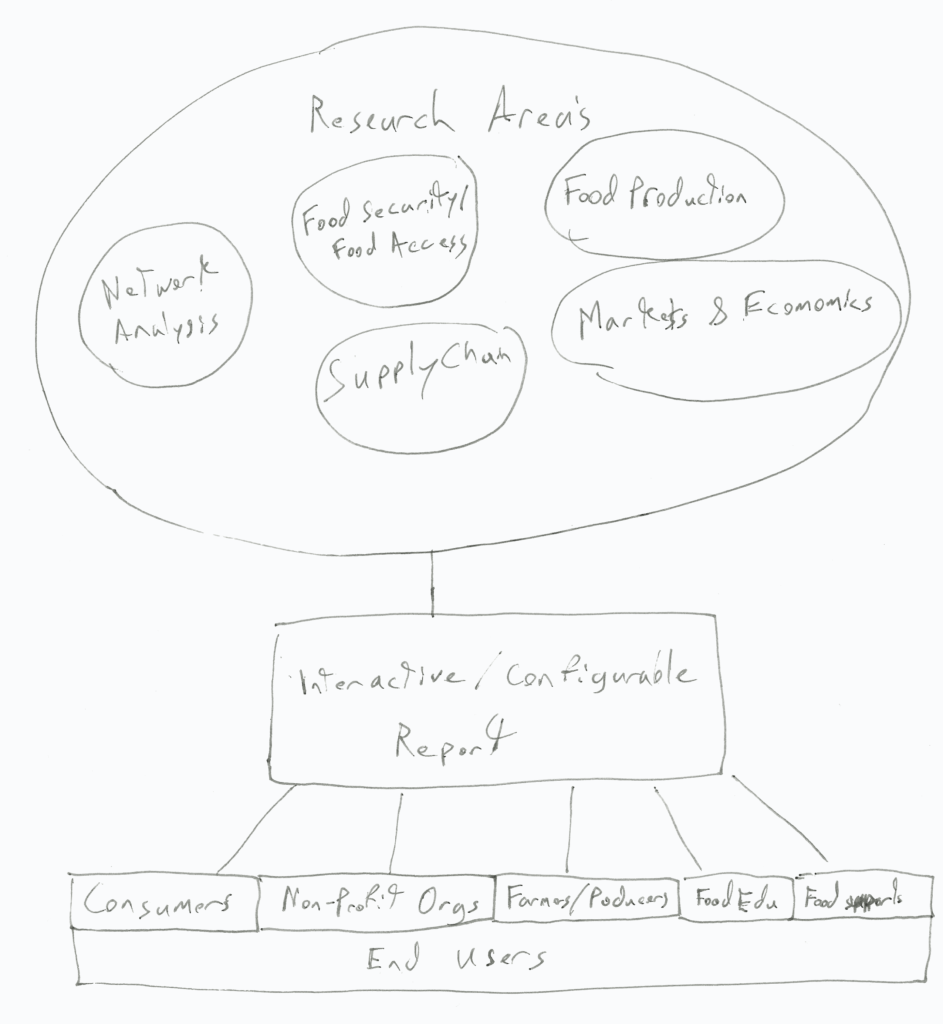
Research Areas
Based on our client’s goals and our own firm’s experience of working in food systems, we chose to work on focusing our research in these five areas. Within these, we focused on how each affected the end user in their specific roles or personas.
- Food security and food access
- Food production and agriculture
- From an equity perspective and an economic perspective
- Market and economic opportunities and barriers
- Viewed from both the micro and macro scales across the region
- Supply chains
- Including regional infrastructure, import and export data, and geographic impacts
- Community and network analysis
- Used for both partners in this work and power structures inherent in the regional infrastructure
Food System User Roles / Personas
While the scope of this project wouldn’t allow for us to create specific studies for each of these roles, whenever possible we would create copy and data visualizations that would be helpful to as many of the roles as possible. Our intent was to create an interactive report that would allow important information to be gained by any of these end users.
- Resident / Consumer
- Non-Profit Organizations
- Food Banks, Public Health, Governmental
- Farmer / Producer
- Food Experts
- Food Educator, Extension Agent
- Food Support Businesses
- Wholesaler, Farm Supplier, Supply Chain Agency
- Value Added Producer
- Restaurants, Food Processor, Breweries
Prototype
We designed the user flow to be very linear and in a narrative format. Our thought process was that even if some visitors didn’t have a deep understanding of how the food system works, they would be guided along showing them how all the pieces fit together.
Unfortunately due to time and budget constraints a normal iterative process for both design and user flow was not possible. As is often the case in the real world, you do the best you can with what you’ve got – and I’m very proud of what our team was able to produce.
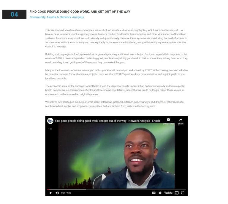
We chose to have each of the of the team members that led an area of research record a short video. This was intended to engage users, to provide different ways to consume the data for different learning capacities, and to given all visitors a more human perspective on the data.
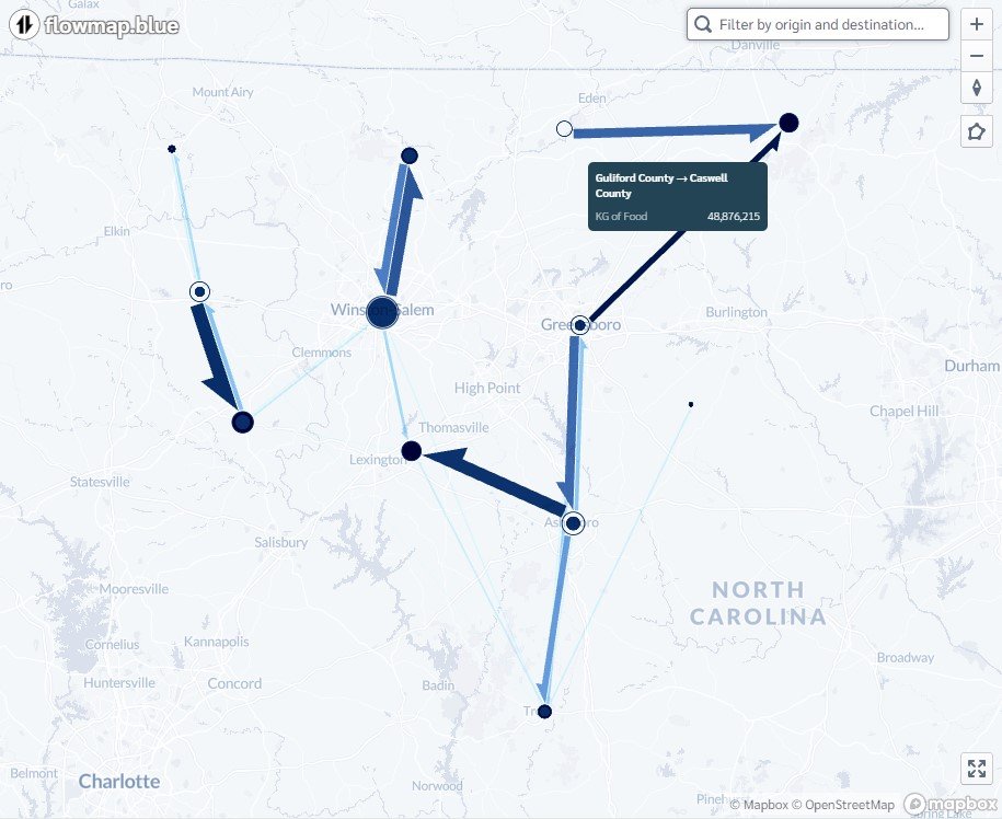
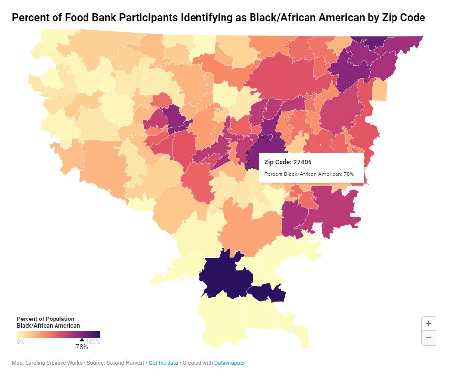
Data visualization was an import part of the report to help people gain an understanding the data and to help those working in the industry make decisions.
Our team wanted to create many more visual and interactive elements for this data. However, the backend of government systems significantly limits the tools, embeds, and implementation of interactive components. Even with these constraints, the amount of data visualization that we were able to produce, on old backend systems and with free tools, in such a short period and with virtually no budget, was amazing.
Takeaways
This was such an amazing project to be involved in, with such a sweet and incredibly talented team. I’m so proud of what we what we were able to create. Its even more astounding to me that we decided to take the initiative to as team to put together this interactive report so that this research could be accessible to the people who needed it, instead of taking the typical governmental approach of burying the information in a 300+ page PDF file that would never again be read.